


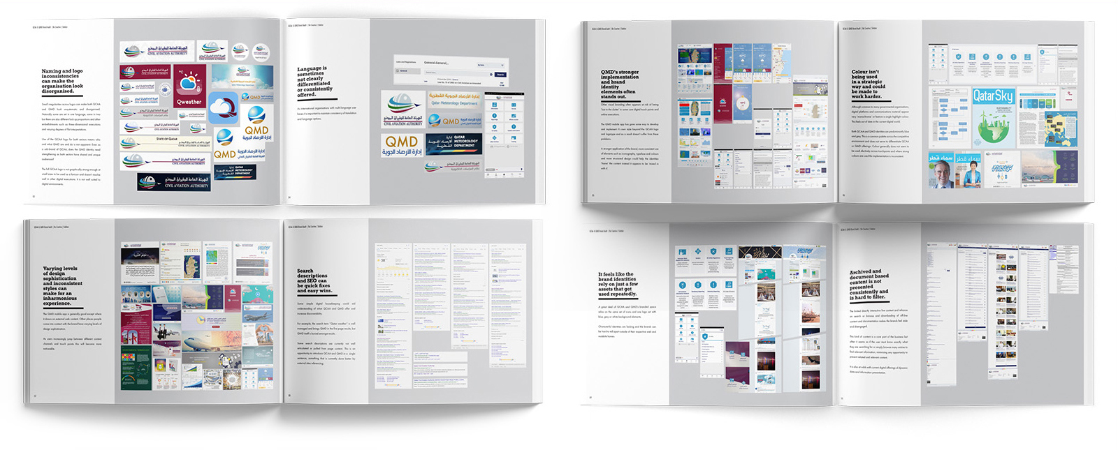
We kicked of the project with extensive research to understand the current implementation of the QCAA’s brand. We conducted a thorough audit of branding materials, revealing inconsistencies across departments. For example, while the weather bureau maintained some level of consistency, other areas used outdated logos, mismatched colors, and varied typography, diluting the authority’s brand.
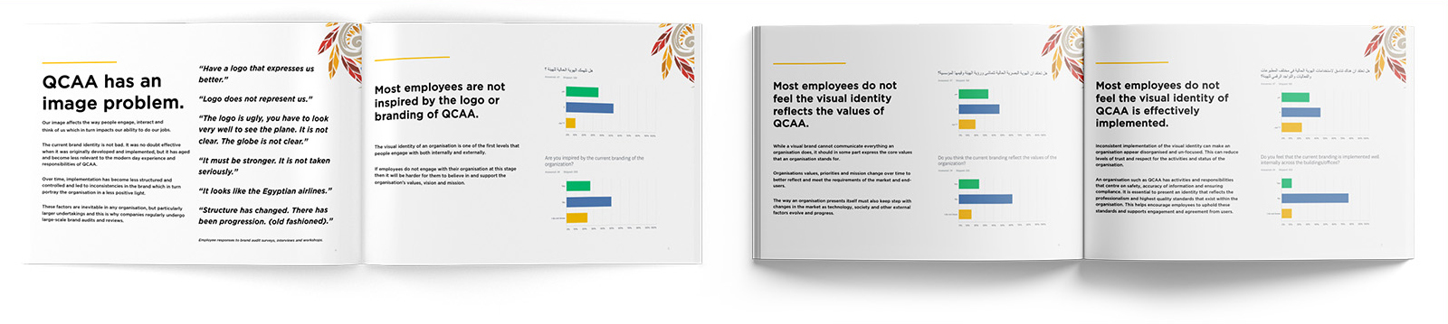
To gain deeper insights, we created an anonymous online questionnaire for staff members, which revealed a disconnection from the brand and uncertainty about its core values. This highlighted the need for a unified and inspiring identity that reflected the QCAA’s role in ensuring safe, reliable air travel.
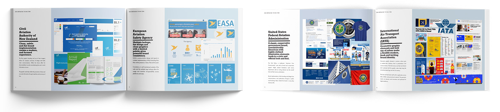
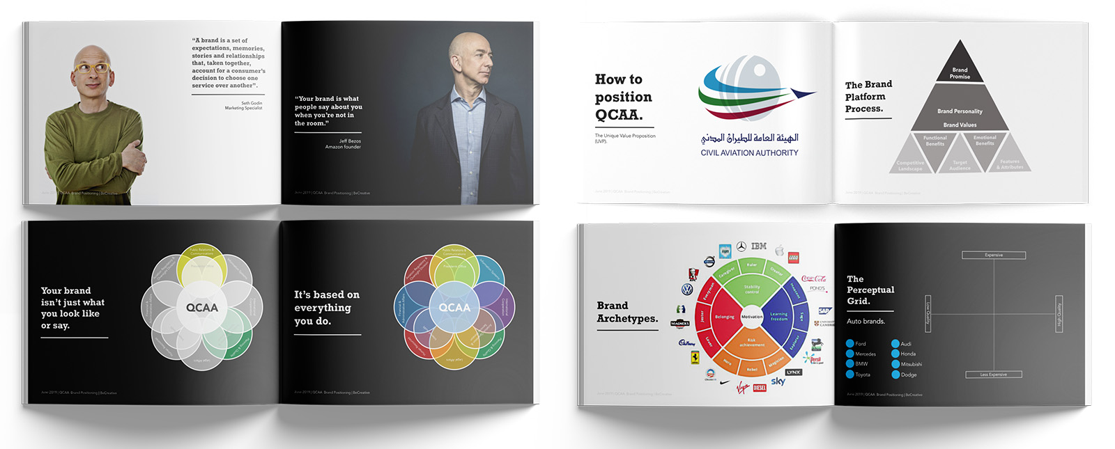
We also assessed the competitive landscape by analyzing how other aviation authorities approached their branding. The U.S. Federal Aviation Administration (FAA) maintained a traditional identity, while the International Air Transport Association (IATA) embraced a colourful, modern approach. This provided valuable context for positioning the QCAA’s brand, balancing tradition with modernity and authority with approachability.

With this information in hand, we conducted on-site workshops in Doha with QCAA staff and management. These workshops were crucial in ensuring that everyone understood the value of the brand and the importance of the rebranding exercise. We presented the findings from the internal audit and questionnaire, emphasizing the need for a consistent and compelling brand identity.
During the workshops, participants engaged in exercises to define the brand’s core values, identify its strengths, and articulate a clear vision for the future. This process also helped to break down resistance to change, as staff recognized how a stronger brand could enhance the QCAA’s reputation and effectiveness.
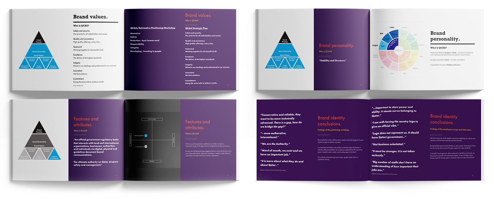
A key insight was that the QCAA’s brand was not about traditional competition but positioning Qatar as a world leader in aviation regulation. This unique role required a brand that was reliable, secure, strong, and authoritative – qualities that resonated with both staff and leadership.

The final phase involved synthesizing these insights into a cohesive brand identity. Using Jung’s archetypes, we developed a brand personality that embodied the “Ruler” archetype, representing control, order, and security, with elements of the “Caregiver,” reflecting the authority’s commitment to safety.

The new brand identity was designed to be modern and authoritative, with a clean, minimal aesthetic. The logo was refined for versatility and recognition across platforms. Comprehensive brand guidelines were developed to ensure consistency in implementation across all departments.
Ultimately, the rebranding of the QCAA was not just a visual update but a strategic realignment of the organization’s identity. The new brand met all the initial criteria and positioned the QCAA as a leading authority in global aviation. The successful rebrand is positioned to enhance Qatar’s reputation, attracting increased air traffic and reinforcing the country’s competitive advantage.